Redesign
Client
Staples
Project Date
2020
Project Details
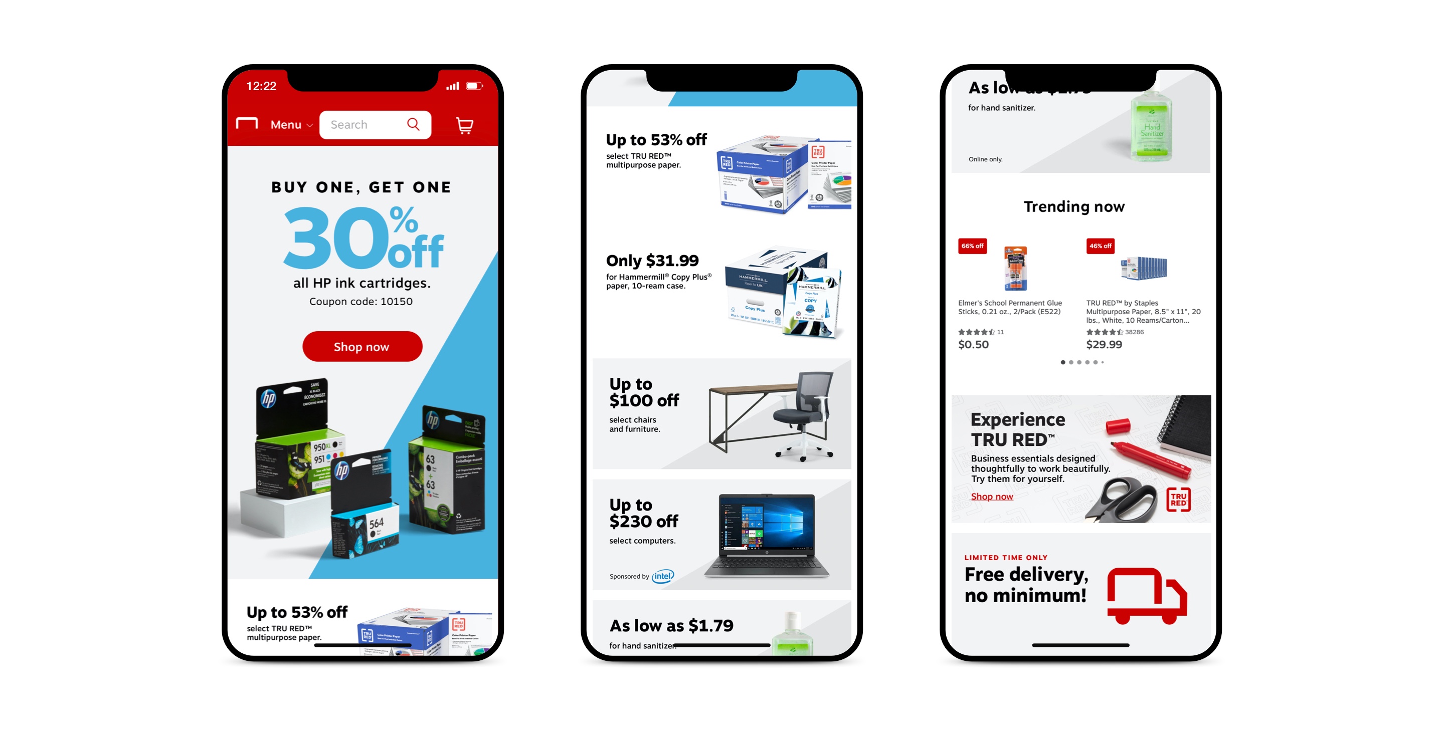
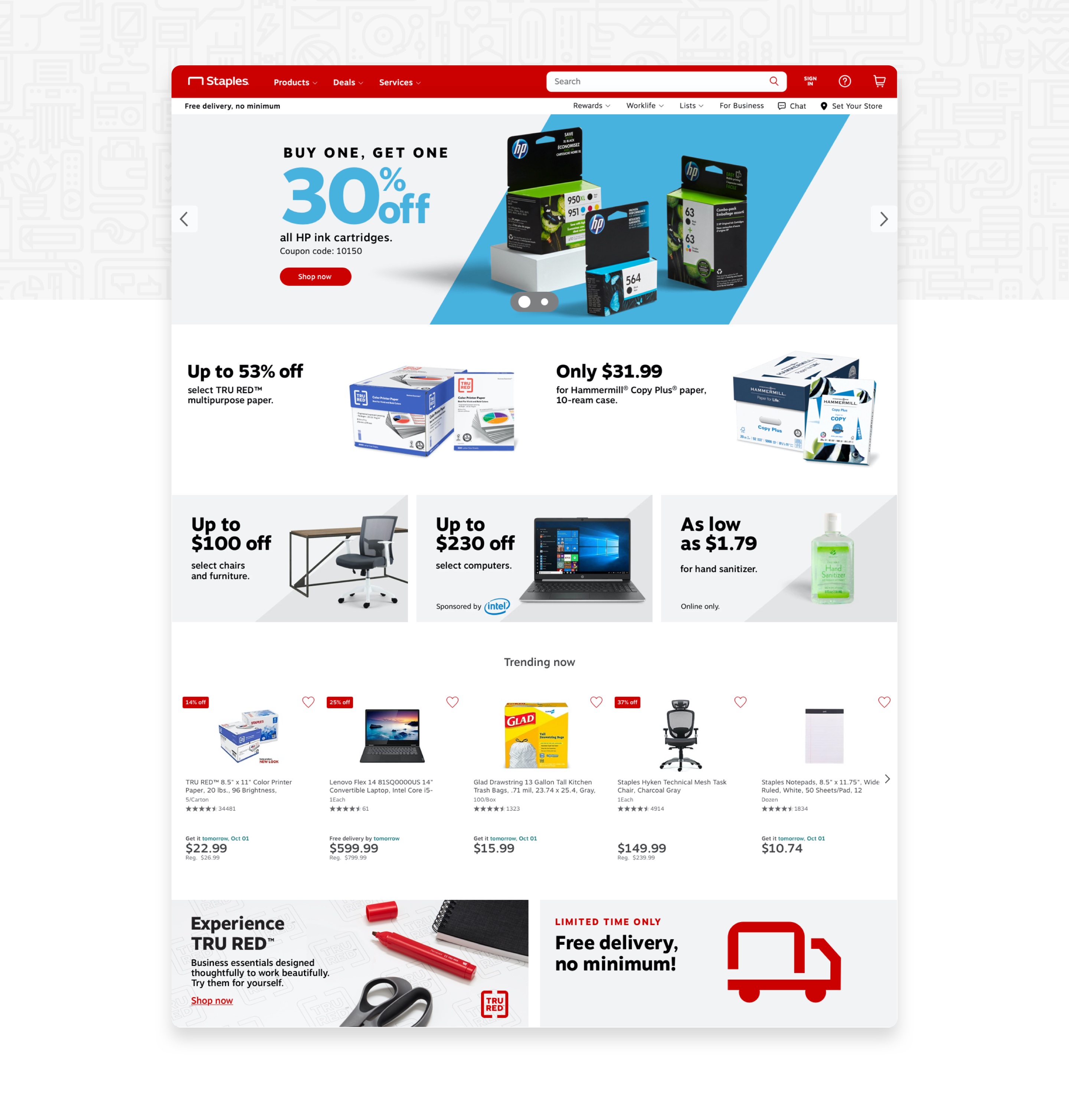
Staples wanted to redesign their homepage to help customers get the best deals. With the known user research and analytics, we knew the usual customer was mostly interacting with the top half of the page. Even if we had excellent prices and enticing promos around the middle of the website, it didn't get that much clickthrough.
With this in mind, we redesigned the new site to have the best top 6 offers at the very top. Getting rid of clutter and unused white space, that way we can get more offers as close to above the fold. Collaborating with the stakeholders and sales, we were able to find a balance between a clean design while still serving all offers.
Landing Pages
Client
Staples
Project Date
2019
Project Details
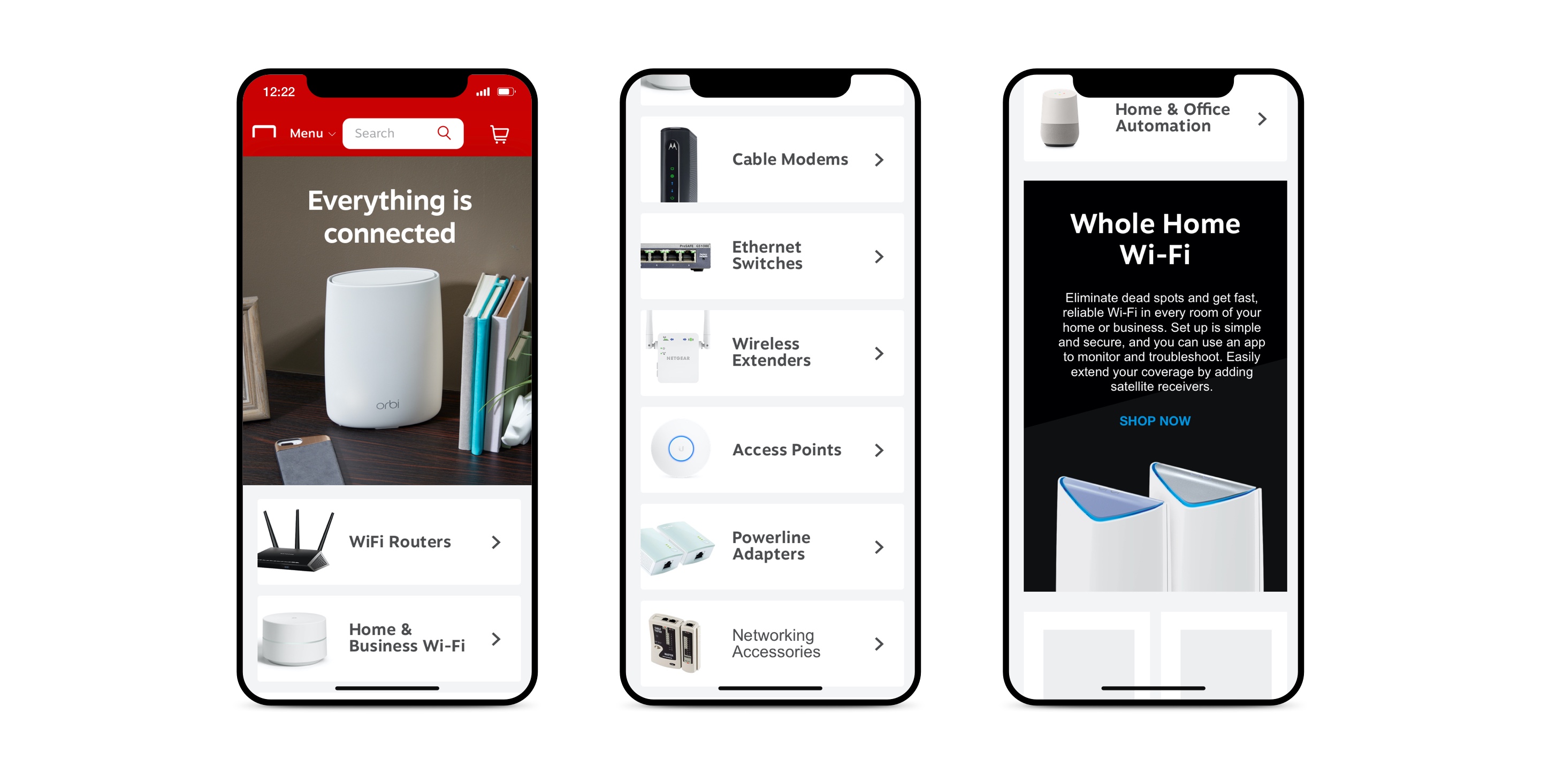
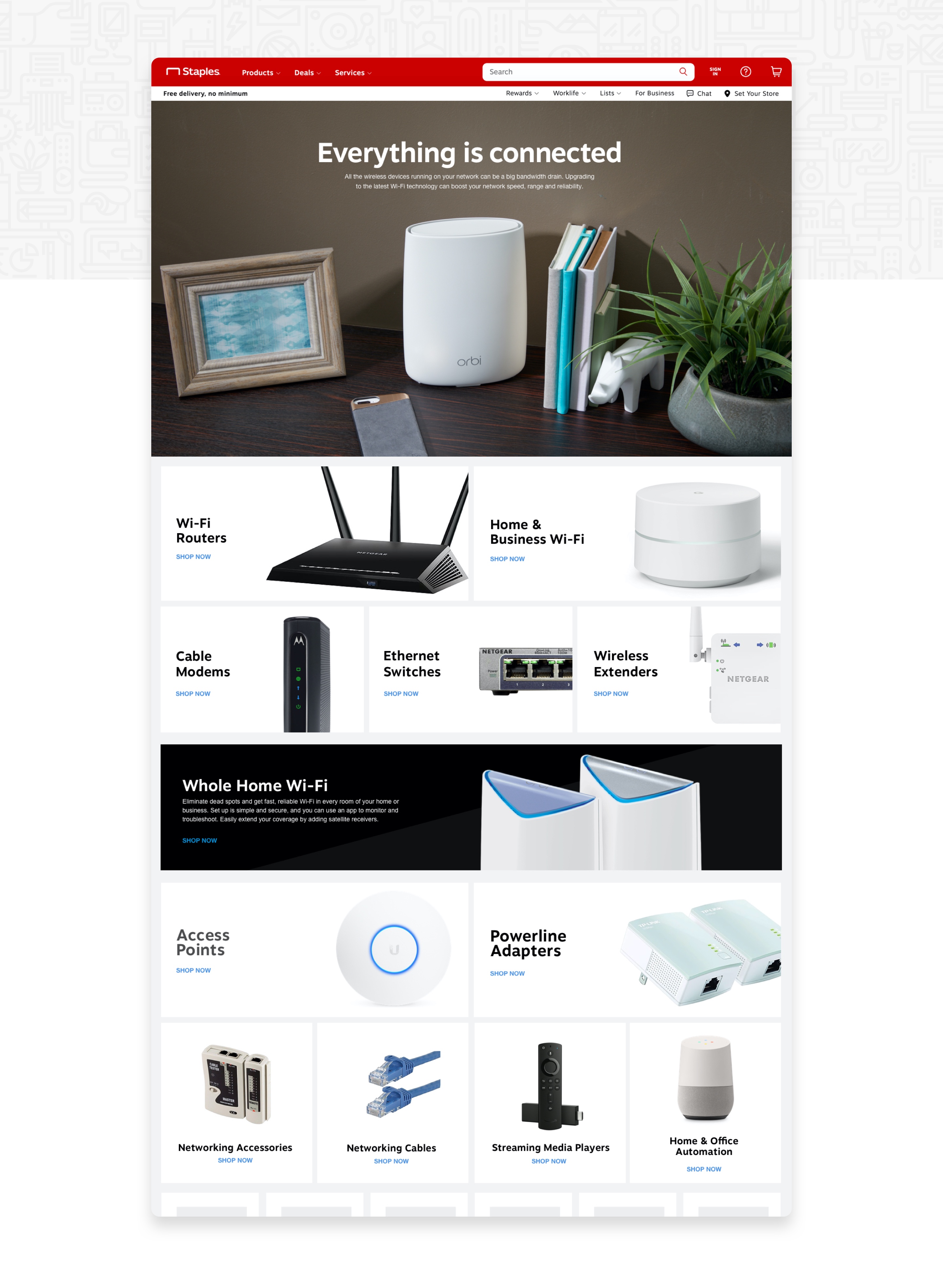
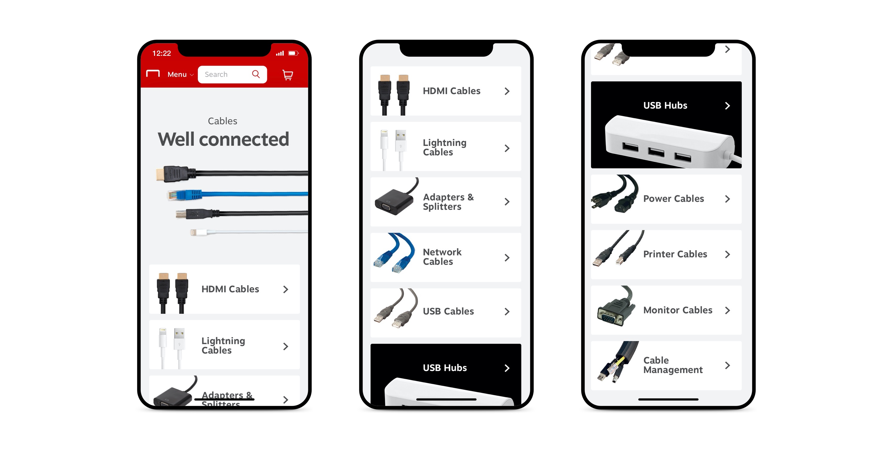
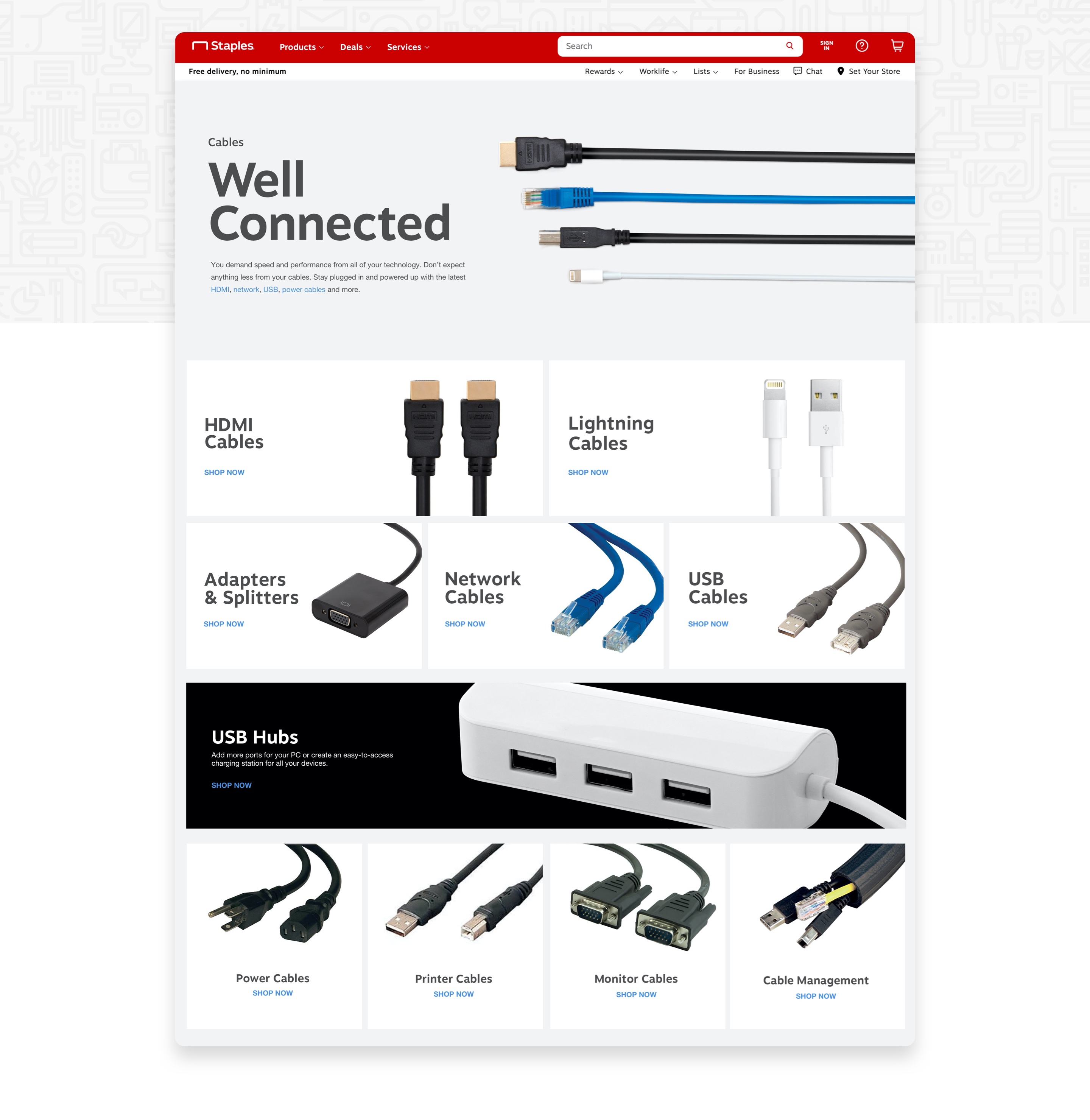
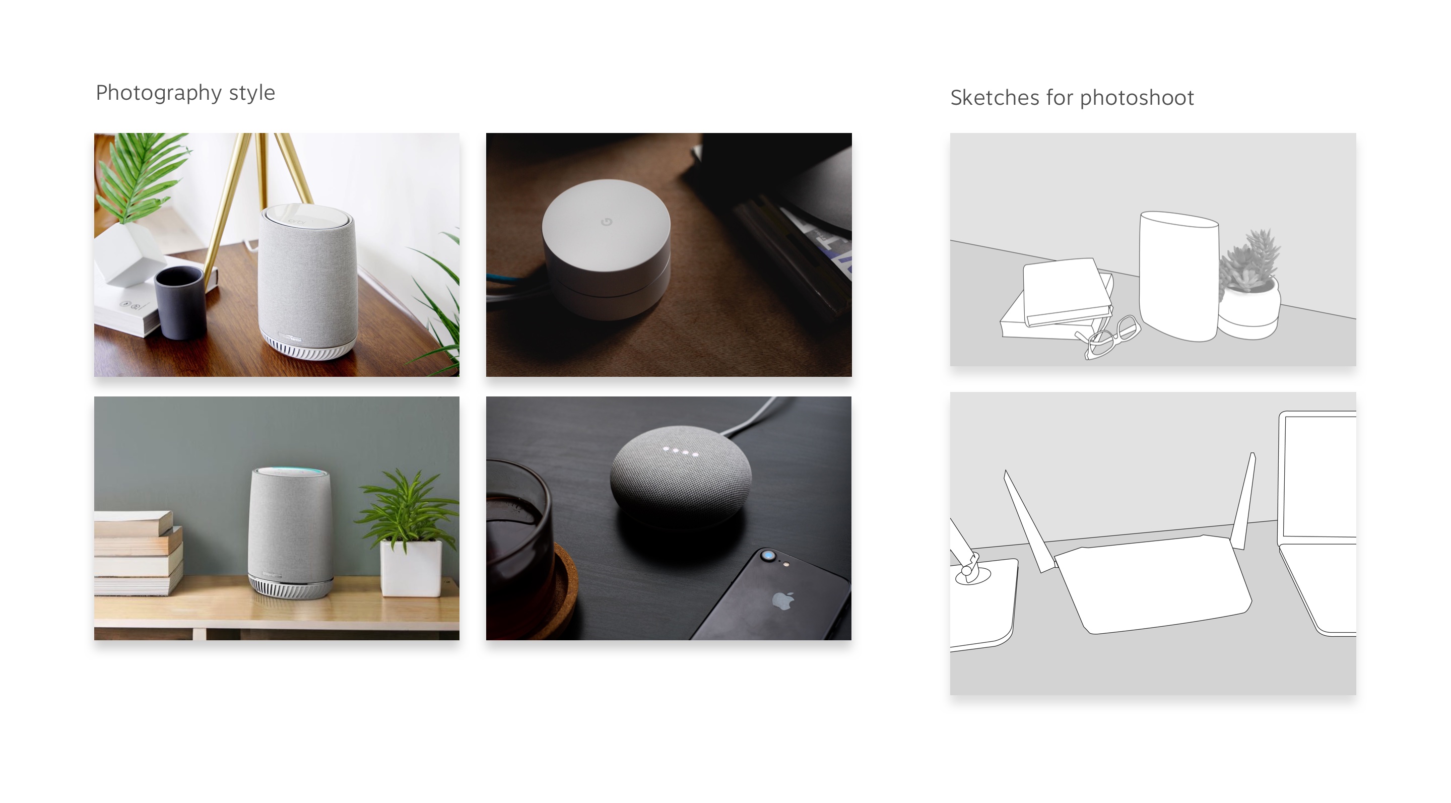
I was given the task of creating a new experience for the cable and network category. In addition to the UX and visual work I created for this page, I art directed the photoshoot—working with a photographer and stylist.
Our target audience was in the age range of 25-30 and was not very tech-savvy. Knowing this, a common challenge with these two categories was that the products could be easily mistaken since some can be very similar to others. The solution for this was to zoom into the parts that make the product unique.
Improving the process
Client
Staples
Project Date
2020
Project Details
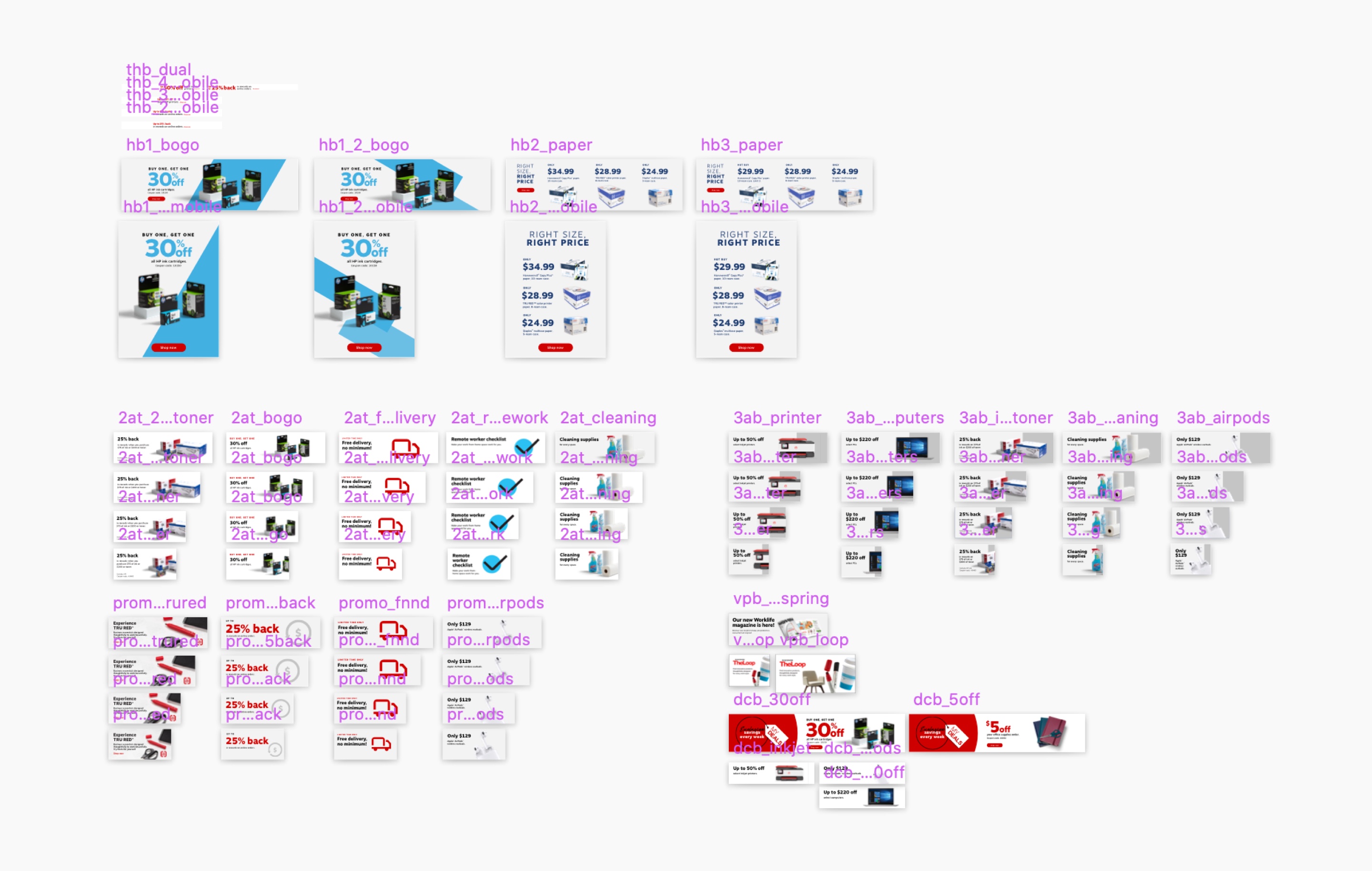
Previously, the process of releasing images every week for the homepage at staples.com was very time consuming as they needed to be released as images, and we had to build breakpoints for each of them. The issue is that it was made in Photoshop, and a single file can take up to 1GB. That's fine for couple of images, but when you have up to 120 artboards with somewhat high-quality images, everything gets slow. Exporting all images took almost an hour (if it didn't crash). I took a weekend to develop a new process to render and export all images using Sketch. After a couple of hours, I had a working solution that I presented the following Monday to the team—they loved the idea.
With Sketch, a file with 60-120 artboards (exporting at @2x), takes up around 60mb and can export all assets in a matter of seconds. This cut down the production time by more than 50%. Not to mention, working on Sketch is a lot faster compared to Photoshop. I'm not saying Sketch is a one-stop-shop for everything, but it is a no brainer for anything related to UI.
I then prepared structured documentation for the team to transition to the new process. Not going to lie, it felt really good to see my team save a lot of time doing these. I hope they keep using this new process and improve upon it.
